As an Amazon Associate, I earn from qualifying purchases. Privacy Policy / Terms
Working from home has become the new normal for many of us, and if you’re spending hours a day in your home office, it should be a space that feels productive, calm, and inspiring. Painting is one of the fastest ways to refresh a room—but only if it’s done right.
Unfortunately, there are plenty of mistakes people make when painting their home offices that can turn a simple upgrade into an expensive headache. At Crocker Home Painting, we’ve seen it all—so we’re here to help you avoid the common traps, pick the right colors, and even suggest a few tools and accessories to make the job smoother.
Let’s get into the most common painting mistakes—and how to fix them before they happen.
Choosing Colors Based on a Paint Chip Alone
The Mistake:
You find a color that looks great on the tiny sample at the store, bring it home, paint the wall—and hate it. The lighting in your home, the size of the room, and even the direction your windows face can totally change how a color looks.
The Fix:
Always test before committing. Buy a sample pot (most brands offer them), and paint large swatches on each wall. Look at them during different times of day. Live with it for a few days before making your final call.
Helpful Product: Peel-and-stick paint samples from brands like Samplize are a mess-free option that you can move around the room.
Going Too Dark in a Small Space
The Mistake:
Dramatic, moody tones are trending, but a dark navy or charcoal gray can make a small home office feel like a cave—especially if there’s limited natural light.
The Fix:
Stick to lighter shades if your office is tight or windowless. Think soft blues, warm whites, gentle greens, or muted earth tones. If you want a darker color, use it as an accent wall rather than the whole room.
Pro Tip: Light-reflecting paint finishes like satin or eggshell can also brighten a space compared to flat finishes.
Ignoring the Psychology of Color
The Mistake:
Bold reds? Energetic oranges? They look exciting… until you realize they’re triggering stress or restlessness when you’re trying to focus.
The Fix:
Color impacts mood. For home offices, aim for colors that promote focus, calm, and clarity.
- Blues = Focus and calm
- Greens = Balance and peace
- Warm neutrals = Comfort without distraction
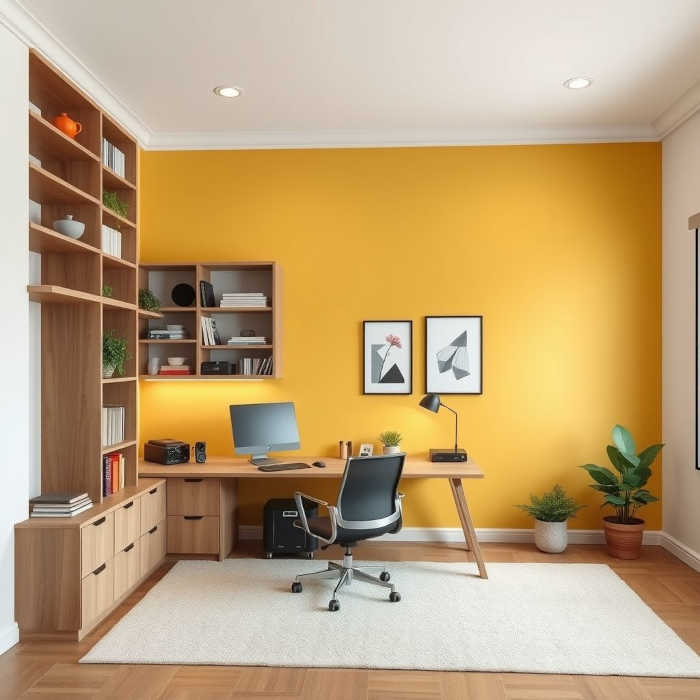
- Muted yellows = Energy and creativity (use sparingly)
Idea: Check out paint lines that offer “wellness” palettes or productivity-themed collections.
Skipping Proper Wall Prep
The Mistake:
You’re excited to get painting, so you skip the boring stuff—patching holes, cleaning the walls, sanding bumps. The result? A sloppy finish that doesn’t last.
The Fix:
Prep is 80% of a good paint job. Here’s what you need to do:
- Wash walls with mild soap to remove dirt and oils.
- Fill holes and cracks with spackle.
- Sand rough spots.
- Use painter’s tape to protect trim and baseboards.
Items to Grab:
- Spackle + putty knife
- Sanding block or pad
- Painter’s tape (FrogTape or ScotchBlue)
- Drop cloths to save your floors and furniture
Using the Wrong Paint Finish
The Mistake:
Flat paint looks smooth and hides imperfections—but it marks easily and can be hard to clean. Not ideal for a high-traffic room like your home office.
The Fix:
Choose the right finish for function and style:
- Matte/Flat: Great for ceilings or low-use walls.
- Eggshell or Satin: Best for home offices—easy to clean, slightly reflective.
- Semi-gloss: Use on trim or doors for contrast and durability.
Forgetting About Natural and Artificial Light
The Mistake:
What looks warm and cozy in one room might look dull and cold in another due to lighting differences.
The Fix:
Test colors with both daylight and artificial light. If your room gets little sunlight, avoid colors with cool blue or gray undertones—they’ll feel colder.
Lighting Hack: Swap standard bulbs for full-spectrum or daylight LEDs to bring more clarity to your space.
Not Painting the Ceiling or Trim
The Mistake:
You change the wall color, but leave the trim and ceiling dingy or mismatched—sabotaging the overall look.
The Fix:
Freshen up the trim with a clean white or a crisp contrasting color. Don’t ignore the ceiling—painting it a slightly lighter shade of your wall color can make the room feel taller and more cohesive.
Pro Tip: Use angled brushes for clean trim lines and extension poles for easy ceiling access.
Rushing the Job
The Mistake:
You slap on the paint, skip the second coat, or remove painter’s tape before the paint dries. End result? Streaks, drips, and peeling edges.
The Fix:
Take your time. Follow the paint can instructions for dry time between coats. Don’t overload your brush or roller. And remove painter’s tape slowly at a 45° angle once the paint is dry to the touch.
Using Cheap Tools
The Mistake:
You go all-in on expensive paint, but skimp on brushes, rollers, or trays. Cheap tools shed, leave streaks, and waste your time.
The Fix:
Invest in quality gear. Trust us—it makes a difference.
Essentials to Invest In:
- High-quality angled sash brush (2-inch)
- Lint-free roller covers
- Sturdy paint tray with liners
- Extension pole for high spots
Brands We Like: Purdy, Wooster, and Handy Paint Products.
Not Considering the Bigger Picture
The Mistake:
You pick a paint color without thinking about your furniture, flooring, or even what shows up on camera during Zoom calls.
The Fix:
Step back and look at your whole office setup. If your furniture is bold, keep the walls neutral. If you’ve got wood tones or exposed brick, choose colors that complement rather than clash.
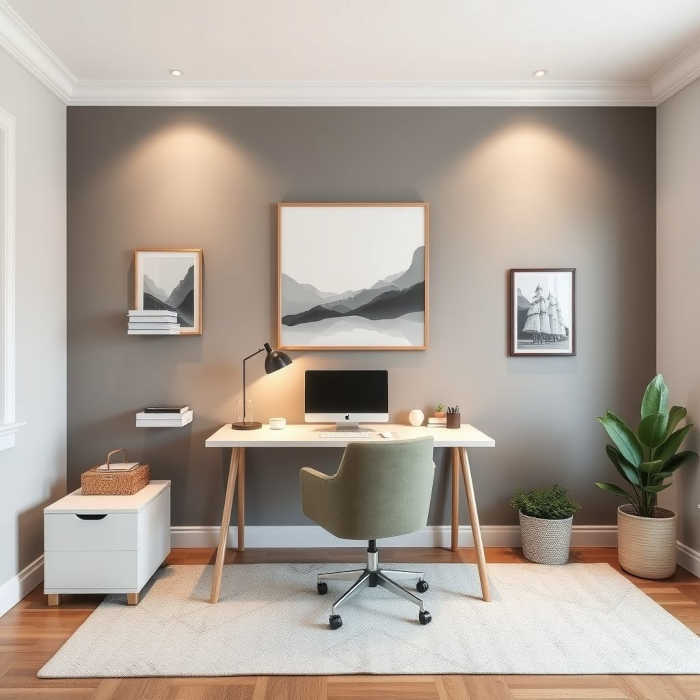
Idea: Add a feature wall behind your desk in a soft accent color that looks great on video calls—just make sure it’s not too loud or distracting.
Bonus: Paint Color Ideas That Work for Most Home Offices
Need inspiration? Here are a few timeless color choices to consider:
- Benjamin Moore “Revere Pewter” – A warm greige that’s endlessly flexible.
- Sherwin-Williams “Sea Salt” – A muted green-gray that’s calming and fresh.
- Behr “White Mocha” – A soft, creamy off-white with warmth.
- Farrow & Ball “Hague Blue” – A bold, elegant navy (great for an accent wall).
- PPG “Olive Sprig” – A natural green that feels grounded and modern.
Ready to Paint Smarter, Not Harder?
Skip the stress, mess, and guesswork. Let Crocker Home Painting turn your home office into the ultimate productivity zone—with zero regrets and zero redo’s. Whether you need a full interior refresh or just want expert help picking the perfect color, we’ve got your walls (and your back) covered.
Let’s get your home office working for you.
Views Expressed DisclaimerThe views, opinions, and information presented in this article are for informational purposes only and do not necessarily reflect the official policies or positions of Crocker Home Painting Company. While every effort has been made to ensure accuracy, Crocker Home Painting Company is not liable for any errors, omissions, or decisions made based on the content provided. Readers are encouraged to consult professionals for specific advice or assistance related to their unique circumstances.

