As an Amazon Associate, I earn from qualifying purchases. Privacy Policy / Terms
Thinking of a home refresh this summer? Good call. Summer 2025 is all about color with personality—not too wild, but far from boring. Whether you’re repainting your whole exterior or just updating a front door, the right shade can totally shift your curb appeal. This year, it’s not just about the what, but also the how and where. Let’s walk through the standout colors of Summer 2025 and how to use them to give your home real character—whether you’re going bold or playing it smart.
1. Golden Rice (Behr S290-6)
Imagine a warm terracotta that doesn’t scream Southwest but still brings the heat. Golden Rice gives a sunbaked, earthy vibe that works great on stucco homes or brick. It pairs best with creamy whites (try Behr’s Swiss Coffee) or even muted greens for a natural look. Want something bold but timeless? This is your move.
Where it works: Full exterior for Spanish-style homes, accent walls, shutters, or front doors on modern craftsman homes.
2. Naval (Sherwin-Williams SW 6244)
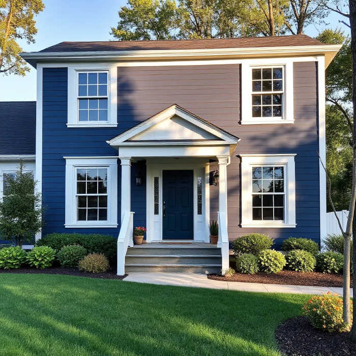
This deep navy has been hanging out on trend lists for a few years—but it’s not going anywhere, and for good reason. It’s rich, elegant, and incredibly versatile. Use it for a full siding refresh if you’re into dramatic, moody exteriors, or go more subtle with a front door or shutters.
Pair it with: Crisp white trim (like SW Extra White 7006), copper fixtures, or natural wood accents.
Pro tip: Avoid using Naval with cooler grays unless you want a very modern contrast.
3. Olive Grove (Sherwin-Williams SW 7734)
Greens are everywhere right now, but Olive Grove hits a sweet spot between classic and modern. It feels grounded and earthy, not trendy for the sake of being trendy. If you want your house to feel serene without being washed out, this is it.
Best use cases: Whole house color for ranch-style or mid-century homes. Also looks great on shutters with a white or taupe body.
Looks sharp with: SW Accessible Beige (7036) or even something warm like SW Alabaster (7008).
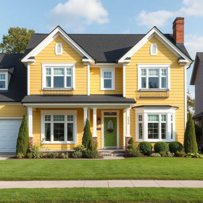
4. Frittata (Behr M290-2)
Okay, yellow can be tricky. But Frittata is that buttery, soft yellow that feels vintage without being dated. It brings a sunny, cheerful vibe that fits perfectly in beach towns, historic neighborhoods, or anywhere you want to stand out without screaming for attention.
Where it shines: Cottage exteriors, porch ceilings, or as an accent on shutters and doors.
Mix it with: Behr Ultra Pure White or a soft gray like Behr Silver Drop (790C-2).
5. Perfect Taupe (Behr PPU18-13)
This one is for the neutral lovers who still want some dimension. Perfect Taupe isn’t too warm, isn’t too cool—just the right modern, grounded backdrop. If you’ve been stuck between beige and gray, this may be your happy medium.
Try it as: A whole-home color with black or dark bronze windows, or a low-key contrast to a bolder front door.
Complement with: Behr Carbon (PPU18-01) or Behr Cotton Knit (OR-W15).
A Few Quick Tips Before You Paint
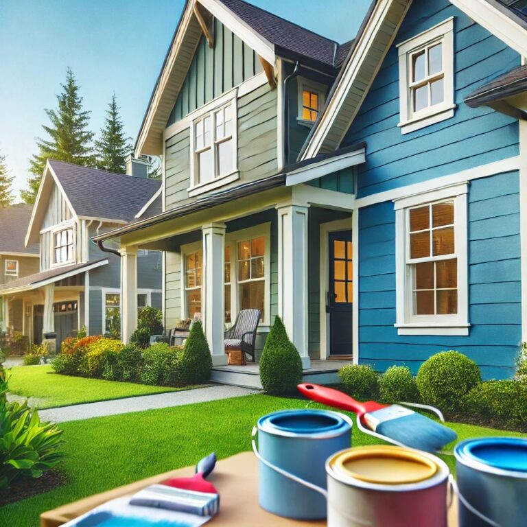
- Test in sunlight and shade. Outdoor lighting changes everything. What looks soft and subtle in the shade might look way more intense in direct sun.
- Consider your roof and landscaping. You don’t need to match them, but your paint should play nice with what’s already there.
- Start small. Not ready to go full transformation? Start with the front door or trim to experiment with bolder shades.
Summer 2025 is about bold confidence with balance. You don’t have to play it safe, but you also don’t need to go full rainbow. These colors offer personality without being loud, and they give you room to make the look your own.
Need help bringing it all together? Crocker Home Painting specializes in exterior painting that actually lasts—with prep work that pros notice and neighbors admire. Ready to get started? Click here to schedule your free quote today.
Views Expressed DisclaimerThe views, opinions, and information presented in this article are for informational purposes only and do not necessarily reflect the official policies or positions of Crocker Home Painting Company. While every effort has been made to ensure accuracy, Crocker Home Painting Company is not liable for any errors, omissions, or decisions made based on the content provided. Readers are encouraged to consult professionals for specific advice or assistance related to their unique circumstances.


