


Crocker Home Painting Company – Privacy Policy and Terms of Service
Effective Date: 1/1/2025
Welcome to Crocker Home Painting Company (“we,” “our,” or “us”). Your privacy and trust are important to us. This page outlines our Privacy Policy and Terms of Service. By using this website, you agree to the terms and policies outlined below.
📌 1. Privacy Policy
1.1 Information We CollectPersonal Information: We collect your name, email address, phone number, and other details when you submit contact forms, request estimates, or sign up for newsletters.Non-Personal Information: We automatically collect data such as your IP address, browser type, and pages visited through cookies and analytics tools.
1.2 How We Use Your InformationWe may use your information to:
– Provide painting services and respond to your inquiries
– Schedule consultations and send service updates
– Send newsletters, promotions, or updates (with your consent)
– Analyze website traffic and improve user experience
– Ensure security and prevent fraudulent activity
1.3 Use of Cookies and Tracking TechnologiesWe use cookies to enhance your experience. Cookies help us understand how visitors interact with our website. You can manage cookie settings in your browser. Disabling cookies may affect certain site features.
1.4 Third-Party ServicesWe may use third-party services such as Google Analytics to monitor website performance. Third-party links may direct you to external websites with their own privacy practices.
1.5 Data SecurityWe use industry-standard security measures to protect your personal information. However, no method of transmission over the Internet is completely secure, and you provide your information at your own risk.
1.6 Your Privacy RightsYou may:
– Request access to or deletion of your personal data
– Opt-out of receiving promotional emails via the “unsubscribe” link
– Manage cookies through your browser settings
⚖️ 3. Terms of Service
3.1 Acceptance of TermsBy accessing and using the Crocker Home Painting Company website (the “Website”), you agree to these Terms of Service. If you do not agree, please do not use the website.
3.2 Use of the Website
– You may use the website for lawful purposes only.
– You agree not to use the site in any way that could damage it or impair other users’ experiences.
– We reserve the right to terminate access for users who violate these terms.
3.3 Intellectual PropertyAll content on this website, including text, images, logos, and designs, is the property of Crocker Home Painting Company and protected by copyright laws.You may not copy, reproduce, or distribute any content without written permission.
3.4 Disclaimer of WarrantiesThe content on this website is provided “as is” without warranties of any kind.We do not guarantee that the site will be error-free or continuously available.
3.5 Limitation of LiabilityTo the fullest extent permitted by law, Crocker Home Painting Company will not be liable for any damages arising from your use of the site, including direct, indirect, or incidental damages.
3.6 Changes to These TermsWe may update these Terms of Service from time to time. Changes will be posted on this page with an updated effective date. Your continued use of the website indicates acceptance of the new terms.
📞 4. Contact UsIf you have any questions regarding our Privacy Policy or Terms of Service, please contact us:📧 Email: Contact Page
* Price estimate is for standard grade Paint/Stain other materials only. 1* Each project is unique, and overall complexity can vary. Power washing, scraping, surface preparation, and any necessary repairs will be evaluated individually for each job. Pricing shown is for general guidance only and does not represent a final quote. Any accepted quote will be in writing and signed by Customer and Crocker Home Painting Company. Actual costs can vary significantly based on numerous factors, including the type and condition of surfaces, the age of the home, previous coatings, extent of wear and tear, amount of prep work required, color changes, number of coats, material selections, accessibility, and overall project complexity. Additional considerations such as surrounding terrain, landscaping, slope, and ease of access to different areas of the property can also influence pricing. Photos and details provided by the customer help us offer a more accurate estimate, but pricing may change if additional conditions or requirements are identified during project planning. All examples, ranges, and descriptions are illustrative and subject to adjustment based on the specific circumstances of each individual project. 1* Customer will approve in writing any and all services performed by Crocker Home Painting Company. and approve of the type and specific color of any paint, stain or any other coating.
As an Amazon Associate, I earn from qualifying purchases. Privacy Policy / Terms
Cleveland has a way of testing paint colors that most cities don’t. Our winters are long, our springs are wet, and our light off Lake Erie is some of the most diffused, overcast light in the country. A color that looks crisp in a Phoenix showroom can read muddy on a Westlake colonial by November, and the palettes trending in 2026 are no exception. The colors that actually work here are the ones that handle our weather, complement our brick-and-clapboard housing stock, and still look right after a gray February. Get those three things right and a color earns its keep. Get them wrong and you’re repainting in two years.
The Three Colors Setting the Tone This Year
Every January the big paint brands release their Color of the Year, and for 2026 the three that matter most to Cleveland homeowners all moved in the same direction: away from cool grays, toward warm, grounded, lived-in tones. Sherwin-Williams, Benjamin Moore, and Behr each landed on a different shade, but the through-line is unmistakable.
Sherwin-Williams Universal Khaki SW 6150 is a warm midtone neutral with earthy undertones. Sherwin’s color team calls it the foundation of a “tailored and timeless” palette built around bare essentials and nature-inspired warmth. It’s khaki the way a well-worn canvas jacket is khaki, soft, layered, and grown-up. In Cleveland homes it reads as the modern replacement for the cool grays that dominated the 2010s.
Benjamin Moore Silhouette AF-655 is the bold pick of the year, a rich espresso brown with subtle charcoal undertones. Benjamin Moore drew the inspiration from classic tailored suiting, and that’s exactly how it behaves in a home. It’s not a dark brown that swallows the room. It’s a sophisticated anchor that pairs beautifully with crisp whites, natural wood, and warmer trim.
Behr Hidden Gem N430-6A is the wild card. A smoky jade green with blue undertones, it lands somewhere between a deep teal and a moody forest. Behr describes it as a shade that can act as a neutral or a pop, and that’s accurate. In a Cleveland kitchen or library it gives you the saturation of a jewel tone without the trendiness that would date the room in three years.
Notice what these three colors have in common. Warmth. Depth. Earthiness. None of them are cool, none of them are minimal, and none of them are gray. That’s the shift.
What’s Working Inside Cleveland Homes
Cleveland’s light situation makes interior color choices different than they would be in a sun-drenched market. We get overcast days for most of the winter, and our south-facing rooms still tend to read cool because of the latitude. Two patterns are showing up in interior painters across Westlake, Rocky River, Bay Village, and Lakewood:
Warm neutrals are replacing cool grays as the safe whole-house color. If you painted your home Agreeable Gray or Repose Gray in 2018, that color is starting to look dated against today’s furniture and finishes. Universal Khaki, Accessible Beige, and Edgecomb Gray are the colors taking its place. They read warm in our diffused light and don’t go dingy on cloudy days.
Saturated, moody colors are showing up in defined spaces. Dining rooms, powder rooms, libraries, and primary bedrooms are where homeowners are getting brave. Silhouette on a dining room ceiling, Hidden Gem on a powder room vanity, deep forest greens on a library built-in. These rooms can handle the depth because they’re meant to feel cocooned.
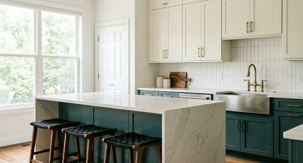
Kitchen cabinets are going darker on the bottom, lighter on the top. Two-tone kitchens are still going strong, and the bottom cabinets are where the bold color lives. Hidden Gem, Naval, Tricorn Black, and warm chocolate browns are dominating lower cabinets, with creamy whites or warm neutrals up top.
If you’re planning a kitchen refresh, cabinet painting is one of the highest-impact updates you can make for the cost, and the cabinet trends this year reward it.
What’s Working Outside Cleveland Homes
Exterior color in Cleveland comes with one rule the rest of the country doesn’t worry about as much: it has to survive the winters. Snow, freeze-thaw cycles, road salt spray, and full sun followed by months of overcast all chew through paint that wasn’t picked or applied properly. The colors that hold up here are the ones with the right undertones and the right product behind them.
Warm whites and creamy off-whites are dominating exterior house painting. Pure cold whites pick up a blue cast in our winter light. Whites with a hint of warmth, like Sherwin-Williams Alabaster SW 7008 or Benjamin Moore White Dove OC-17, hold their tone year-round and pair well with the red brick chimneys and natural stone you see throughout Cuyahoga County.
Deep, grounded siding colors are taking over from gray. Warm charcoals and near-blacks with brown undertones, like Sherwin-Williams Iron Ore SW 7069 or Benjamin Moore Black Fox 2129-10, are showing up across Westlake and Avon Lake new builds and remodels. They photograph well, they hide road grime in winter, and they age more gracefully than the pure cool grays we saw a decade ago.
Front doors are where homeowners take the swing. A new front door color is the cheapest, highest-impact exterior change you can make, and it’s where the bold colors get to shine without committing to a full repaint. The front door colors of the moment lean rich and saturated, from Behr Hidden Gem N430-6A to a classic deep navy like Sherwin-Williams Naval SW 6244.
Matching the Color to Your Cleveland Home
The biggest mistake we see is homeowners falling in love with a color in a magazine and forgetting that their house has its own personality. A 1925 Lakewood century home and a 2018 Westlake new build are not going to wear the same palette. Here’s how to think about it.
For colonials and Cape Cods, the safest moves this year are warm neutral siding with crisp white trim and a bold door. Universal Khaki, Accessible Beige, or Manchester Tan on the body. Pure white or warm white on the trim. Hidden Gem, Naval, or a deep red on the door.
For mid-century ranches and split-levels, lean into the architecture. Warm browns, mossy greens, and natural wood tones flatter the horizontal lines. Silhouette as a trim or accent works beautifully here.
For Lakewood, Tremont, and Ohio City century homes, historical accuracy matters and so does the streetscape. Deep, saturated colors are appropriate, but a color consultation is worth the time. The original color palettes of these homes were specific to their era and going off-script can hurt resale.
For brick homes, your siding color is already chosen for you. The trim, soffit, and door are where the trend colors live. Warm whites or soft creams on the trim, and bold front door colors that pull the warm undertones out of the brick.
When You’re Ready
Color trends are a starting point, not a finish line. The best repaint is the one that fits your home, your light, your neighborhood, and your taste, then gets executed by people who prep properly so it actually lasts. We’ve been painting homes across Westlake, Bay Village, Rocky River, Lakewood, and the rest of Cuyahoga County for over 40 years, and we’d be glad to help you sort through the options.
If you’re curious what a repaint actually costs, see our pricing for real numbers on interior painting, exterior painting, cabinet painting, and deck staining. No mystery, no high-pressure sales calls.
Views Expressed DisclaimerThe views, opinions, and information presented in this article are for informational purposes only and do not necessarily reflect the official policies or positions of Crocker Home Painting Company. While every effort has been made to ensure accuracy, Crocker Home Painting Company is not liable for any errors, omissions, or decisions made based on the content provided. Readers are encouraged to consult professionals for specific advice or assistance related to their unique circumstances.